Since 2014, the National Equity Atlas has served as the nation’s most detailed report card on racial equity. At a time when racial justice is (finally) at the center of our national policy debate, we are thrilled to share this completely updated and strengthened data and policy tool with you!
The National Equity Atlas is a one-stop-shop for data and policy ideas to advance racial equity and shared prosperity. Our focus is providing equity metrics that are deeply disaggregated by race/ethnicity, gender, nativity, ancestry, and income for the largest 100 cities, 150 regions, all 50 states, and the United States as a whole.
We built this site to democratize data and make the facts accessible and actionable to everyone — including the grassroots organizations that possess invaluable firsthand knowledge of inequities yet often lack the resources to gather, analyze, and display the quantitative data so crucial to policy campaigns to address them. At the click of a button, you can see how your community is doing in comparison to other communities according to our Racial Equity Index and 30 relevant, useful, field-tested indicators of racial and economic equity.
Our updated Atlas builds upon our previous data infrastructure but provides a new holistic Racial Equity Index, new indicators, more detailed data for existing indicators, and additional ways to explore, share, and use the data.
Ready to dig in? Here are six essential features to help you explore the indicators in the National Equity Atlas.
1. Racial Equity Index: Start Here
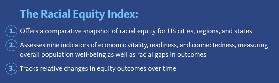
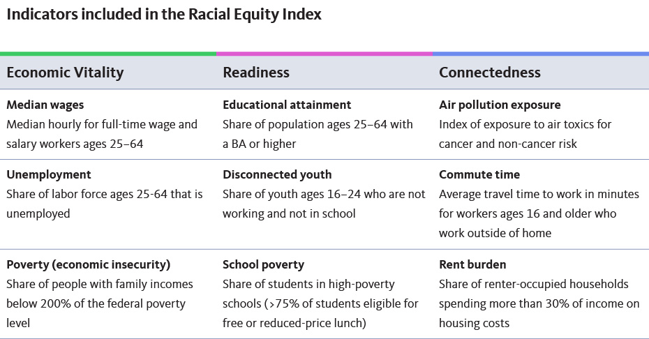
The new Racial Equity Index — available for all geographies in the Atlas — allows you to track how well your community is doing on a set of nine equity indicators compared with other communities (and over time). The index summarizes an inclusion score (which measures racial disparities on nine indicators) and a prosperity score (which measures overall performance levels on those same indicators), and can be further broken down into its components to help you identify the most important challenges and areas of progress to develop targeted equity strategies. You can also examine the prosperity score for each of six major racial/ethnic groups. Here is how to access the index:
C) Choose your geography type (Nation, State, Region, City)
D) Choose your geography from the dropdown menu
E) Explore the data
F) Go back to
Racial Equity Index to examine the Prosperity scores for the Black, Latinx, Native American, Asian or Pacific Islander, Mixed/other race, and White Populations.
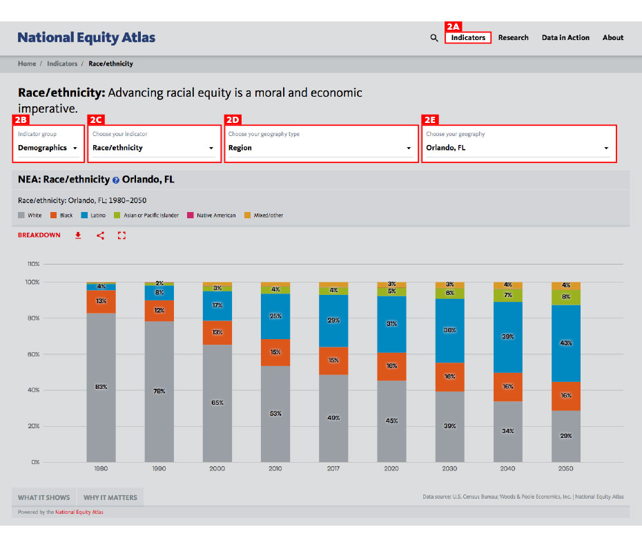
2. Indicator and Geography Selection Toolbar: Your Home Base
Next, explore the individual indicators in the Atlas. Once you are on the page for any indicator, the first interactive element you will find is the Indicator and Geography Selection Toolbar. This toolbar allows you to choose which of our 30 indicators you want to explore for any of the 272 geographies in the National Equity Atlas. To do so, follow these five steps:
B) Choose your indicator group (Demographics, Economic Vitality, Readiness, Connectedness, or Economic Benefits)
C) Choose your indicator from the dropdown menu
D) Choose your geography type (Nation, State, Region, City)
E) Choose your geography from the dropdown menu
Here is how it looks for our
Race/ethnicity indicator for the Orlando region:
Note that the number of geography types available to you will differ from indicator to indicator, based on data availability. For example, you will not see “City” for the Economic gains: Racial equity in income indicator because data is not available for those smaller geographies for that indicator.
Also, once you are on an indicator page, scroll down for key insights about the indicator, the drivers of inequity, policy solutions to consider, and additional resources.
- MASTER IT: Change the geography and pull up the trend data for a community. What groups are growing and which are shrinking?
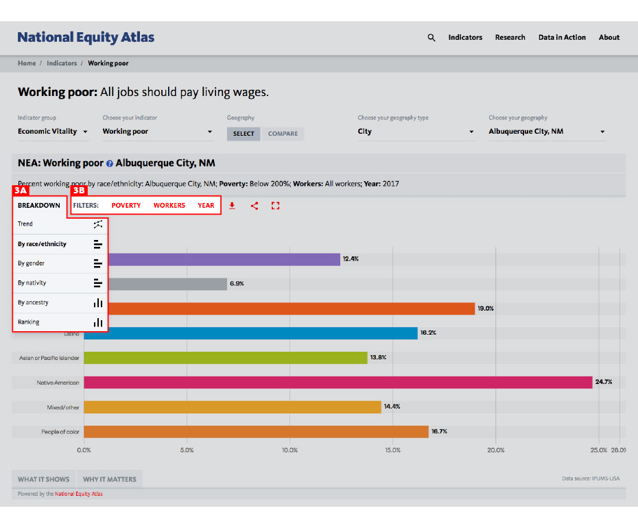
3. Chart Breakdowns and Filters: Explore the Data
The Chart Breakdown and Filters feature is the true engine for data exploration in the National Equity Atlas. This is where you can disaggregate the data such as race/ethnicity, race and nativity, race and gender, ancestry, and poverty level. It is also where you can get indicator-specific breakdowns of the data, such as business ownership by race and by industry or commute time by race and transportation mode.
Take these steps to use the Chart Breakdown and Filters feature:
A) Select your breakdown
B) Select one or more filters
Here is how it looks for our Working poor indicator for the city of Albuquerque:
- MASTER IT: Explore the different breakdowns and filters for this indicator. Which groups are most likely to be working full-time but still in poverty or economically insecure (living below 200 percent of poverty) in your community?
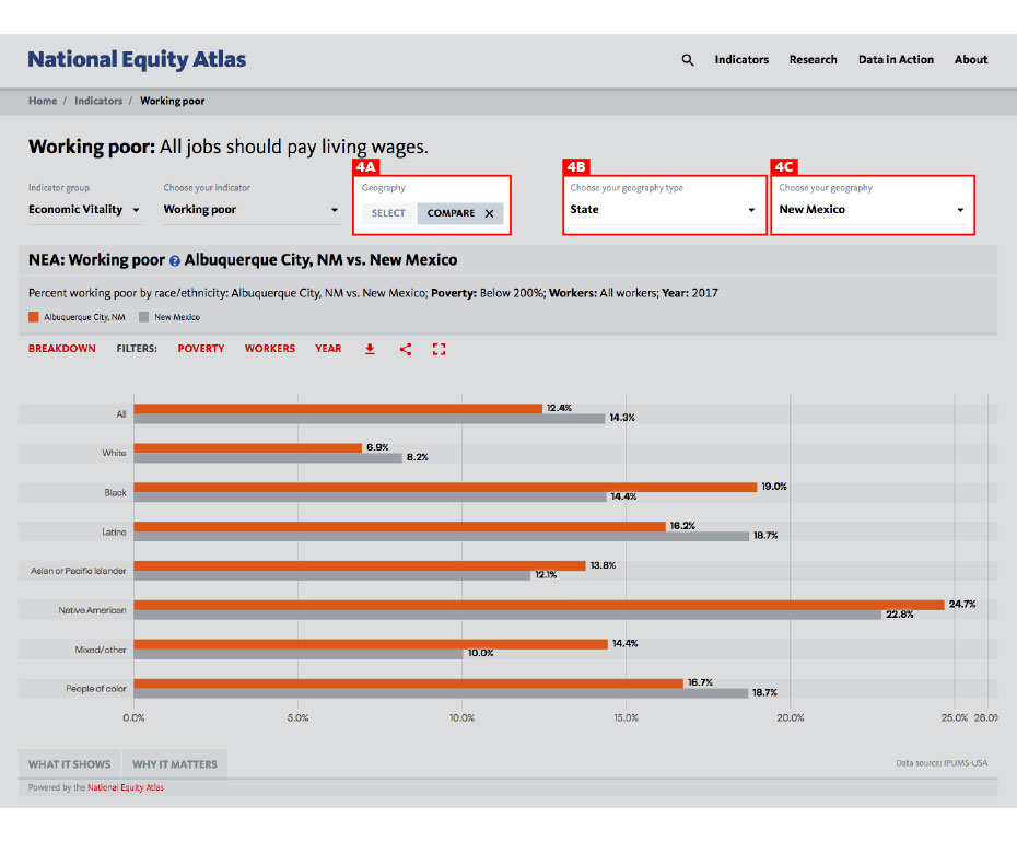
4. Compare: See How Your Community Stacks Up
A fourth essential feature — also in the Indicator and Geography Selection Toolbar — is the Compare function. Comparison is a very important method for analyzing equity metrics, allowing you to see how your community (or a group in your community) is doing in relation to other communities (or the same group in a different community). This can help you understand the extent of disparities, assess what are the drivers of inequities, identify strategies to remove barriers, and set goals for progress on eliminating inequities.
Here is how to use the Compare function:
A) Select compare
B) Select a comparison geography type from the dropdown menu
C) Select a comparison geography from the dropdown menu
And this is how it looks for our
Working poor indicator, comparing the city of Albuquerque to the state of New Mexico:
Note that the Compare function is not available for indicator breakdowns that contain multiple categories over multiple years (like the Race/ethnicity indicator you just looked at) because the display would not be legible.
- MASTER IT: Compare working poverty trends in your city and your state.
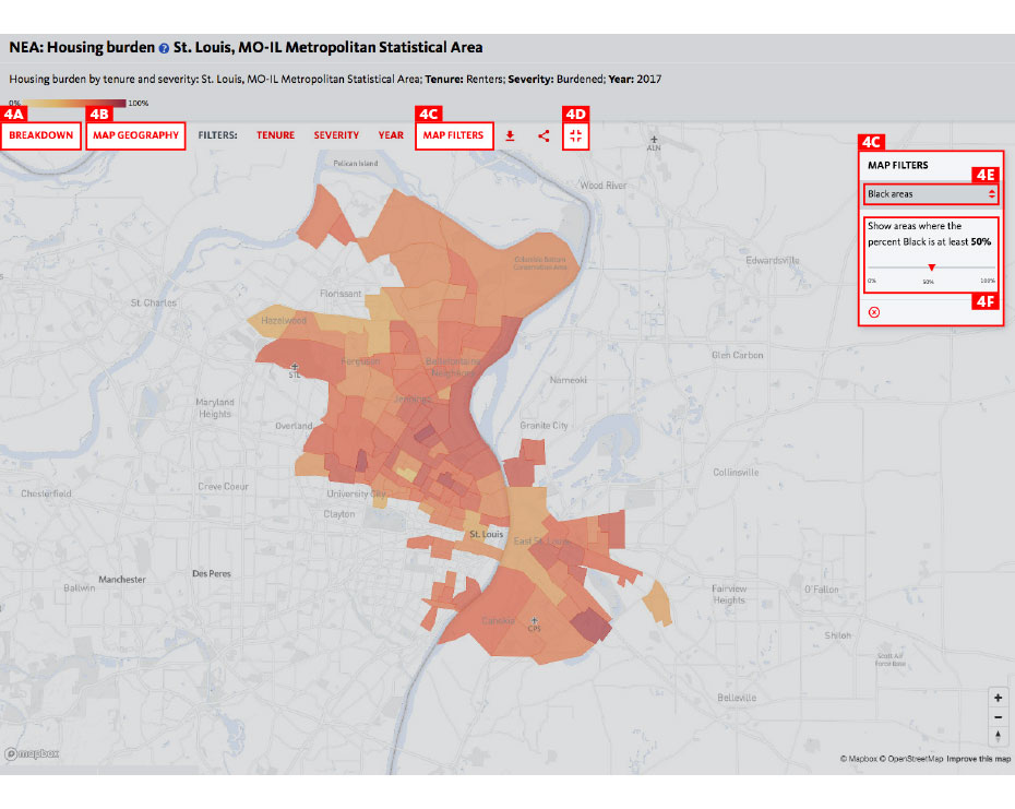
5. Map Filters and Full Extent: Visualizing Patterns
Mapping data by geography puts spatial inequities — which are also racial inequities, due to housing segregation and discrimination — into stark relief. The National Equity Atlas team has worked hard to create a custom mapping system that enables clear visualization of patterns across communities and correlations between race, place, and income.
Follow these steps to Map Filters and Full Extent features:
A) In the chart breakdown, select the map breakdown
B) Under map geography, choose your geography type (Nation, State, Region, City)
C) Select map filters
D) Select map full extent
E) Select a demographic group
F) Use the slider to see how communities with higher and lower shares of your selected demographic group perform on the indicator
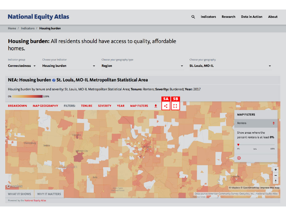
Here is how it looks for our
Rent burden indicator for the St. Louis metro region, looking at majority Black communities by selecting Percent Black, 50% in the map filter:
6. Downloads and Social Media Buttons: Share and Use Data Visualizations
The National Equity Atlas is a tool for community action, and we wanted to make it easy for you to use the data to highlight issues of inequity, build support for campaigns, and make your case for solutions with policymakers and others in positions of power. We also believe in open data and know that you want to be able to explore the raw data yourself. That’s why we built more sharing and download functionality into the National Equity Atlas.
Follow these steps to access our Download and Sharing features:
A) Select download type (Image or Excel worksheet)
B) Select sharing type (Facebook, Twitter, Email)
- MASTER IT: Download an Excel file to examine the data behind a chart or map. Post a National Equity Atlas chart or map on your Facebook or Twitter page.
Thank you for exploring the National Equity Atlas! We hope you are excited enough about these features to let your colleagues know about this new tool. We encourage you to join the discussion on social media using the hashtag #equitydata.